

MICROSOFT SURFACE CONFIGURATOR
Create a better way to sell Surface devices and help users understand what they need and don’t need. Also, increase attach rates for Office, Warranty and other accessories to help customers receive a complete solution to best meet their needs.


Before and After Video
Before

After

Project Timeline & Responsibilities
As the Senior UX designer/Strategist on the Experimentation team, my job is to come up with ideas to increase the key KPI’s for business across our Microsoft e-commerce site. Note, my team doesn’t own any pages, flows, or design across the site. We can only influence, and that is what I did, from conception to testing to shipped product; and now all device sales (not just Surface) will go through this new flow.
1. The Idea
As I was working on some Surface heroes experimentation ideas, I saw the flaws in the Surface purchase path experience and knew I could make it better (although this wasn’t part of my assignment or team ownership, I saw the potential value of this work).
2. Research & Data
I started with research and design heuristics for configuration experiences. Also, I dug into Clicktale heatmaps and videos and past test ideas to find issues and possible solutions.
3. Wire-frames
Created a series of wire-frames and rough prototypes to narrow down the vision, and reached out to the marketing owner of Surface to get them on board to a new solution
4. Prototype
Created interactive prototype to showcase how it would work and to fine tune the interaction. I was now able to pitch across the company
Password: Surface
5. Roadshow & Buy In
Created roadshow deck to go across different teams and orgs to gain buy in and approval as a real project backed by Business and Engineering. This was successful.
6. Design Partnership
I formed a close working relationship with the ENG Design Team on how to test into this new model since they now owned the design. I influenced their models with my own and served as a liaison between Marketing and Design and art directed through influence.
7. Testing Road-map
I created a testing road-map that introduced qualitative testing to go along with our A/B testing, which was a new process for our Experimentation team. There were two main questions we needed to answer in the time-frame that we had.
8. Success
The experiment was a huge win. Therefore Business pushed it to top of the priority list for Engineering to code for October 2019 Device Day for the release of 3 new Surface devices and they saw instant increase in sales and attachment.

Current Flow and Problems

ISSUES
A customer must select all four steps (Color, Processor, Memory, Storage) to see a price in the configurator. They can never tell throughout the process what their choices are costing for each selection. So they can never, for example, compare the cost of an i5 vs. an i7 processor ior 8GB of RAM vs.16GB.
This is not a true configurator. Options presented are not dependent on choices made earlier in the process. For example only the least powerful and most powerful options are available in the platinum color. There are no clues to let the user know that this is the case, so the user is left on their own to figure out why, for example, they can’t get the 1TB drive in Blue.
The devices on sale or out of stock can’t be labeled. Customers won’t know until they choose all four steps.
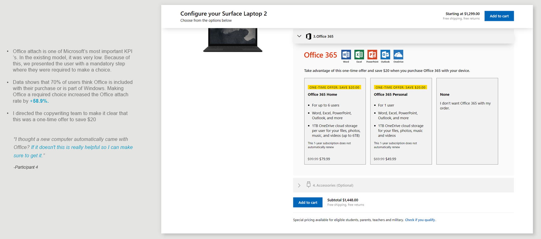
Over 75% of customers think Office is included with their device from Microsoft and there isn’t a clear message indicating that it is not.
User must go to an interstitial page to choose Office, warranty, and other important accessories. This page does not clearly present what is needed and why. The interaction model and look result in a completely different experience as compared to the Configure page.
Requirements and Design Philosophy
Business Requirements
Can not show price for Processor, RAM, HD, Storage.
No default model selected (customer must select each step to keep them accidentally getting something they didn’t want and keep returns down)
Must lead with color even though it makes the UX harder on the customer
Must increase Office and warranty attach
Error messages and CTA need to be “hot”
Clear and Helpful
Help along the way for user that doesn’t know what the terms mean and how much they need for their tasks (Processor, Ram, Storage, Graphics Card)
Clues to show why they can’t get a certain SKU (i.e., the option they want is inactive)
Absence of fear based messaging to get them to buy what we want. (“No protection for your device”)
Optional or required steps labeled
Error messages to show what step they missed
Focus
Focus should solely be on the step they are on
Each step should be able to fit in screen (tablet) so user can see all the choices and how the choice above might affect the choice below)
Choosing their choice triggers the next steps and brings it into focus for the user. (Step like and don’t make the user scroll to work for it)
Easily scanned cards so user can compare
Interaction and patterns
Same interaction pattern for the entire experience- configure and cross-sell
Each step should have something the user needs to click on to move to the next step unless it is optional (in which case it should be put at the end).
Whole card must be hot
“None” card or what is included in first location.
Animations (transition speed) should clearly show what happened
Easy for the user to go back and adjust their choices to fit their budget

Testing Road Map
Given our tight timeline, I worked with Engineering, Design and Business to test our two primary questions: What is the better configuration model? And with the answers to that question, what is the best way to enhance the current attach model?
TEST #1
Which Configuration Model is Better?
I developed a Two-step process over the standard (control) Four-step process (1. Color, 2. Processor, 3. RAM, 4. Storage). First we lab tested the two models, then we adjusted the Two-step process using those findings and A/B tested the two models.

TEST #2
What is the Better Way to Attach?
With the Two-step model as the clear winner we needed to test different ways to attach items to a device purchase. However, with the tight timeline we were only able to test a “drawer” model. We lab tested it first with great results and used our findings to influence the version we A/B tested.

Quotes from Lab Testing
“I liked seeing all the spec options right next to each other. When I was shopping for a new PC, I was getting tired of the long compare charts. I like that this presents each of the models right next to each other.”
-Participant 2
“This was very easy. This was the first time I used it, and we got through it in what, 3-4 minutes? It was simple, I'm able to see a running budget, and I'm given all the choices here, some of what I could ignore if I wanted to.”
-Participant 3
Design Improvements
Choose Configuration

Help Overlay

Choose Warranty

Choose Office 365
Choose Accessories


