

MICROSOFT EDUCATION: OFFICE
Increase instances of students and educators entering their institutions’ email address to receive Office for free


Problem & Goal
Microsoft Education wants all students and teachers to enter their school’s email address because most of them are eligible for Office for free. Additionally, the Education website was dated and needed the look and feel to be updated to compete with Google Education and their free Apps offering.
Solution
As the designer and strategist on the Experimentation team, I came up with two data-derived hypotheses for increasing email sign up through design heuristics and qualitative testing.
Responsibilities
I was responsible for strategy and design, which included: research, hypothesis development, testing road-maps, and full page redesign with content and copy strategy.

Original Flow
I examined and analyzed the current flow form the Education site to Office.com (owned by different teams) and developed hypotheses to address shortcomings via quantifiable testing. Office.com was outside of this project but we advocated to and convinced their stakeholders to include their site in our testing and redesign process.

ISSUES:
Office page: The page was very busy with numerous calls to action (4) that all led to the same place (where students and educators can enter their school’s email address)
Office email page: The flow led the user to a full page on a different site where they had to hunt for the word “free”.
Sign Up Wizard: Once a school email address is entered, a wizard presents questions to validate the email address and see if it the customer is eligible for free Office through their school’s account.
TEST #1
Reduce Anxiety
In lab testing, teachers would often refer to free Office as a trial, meaning that they perceived that they would need to pay for it eventually. In their minds “free” meant trial. We found out that teachers have been burned by “free” offerings before; they would use these offerings for their classes, then months later find out they needed to pay for it, or risk losing the time invested in adapting their processes and lessons to the tool. I managed the rewrite of the copy to speak specifically to this anxiety issue and to mention the Office apps by name for recognition and reassurance. I convinced the stakeholders to let us test on a site that was outside the scope of the project. I knew this was the first hypothesis I needed to validate; then I could address the issues on the Education site in depth.

TEST #2
Reduce Friction
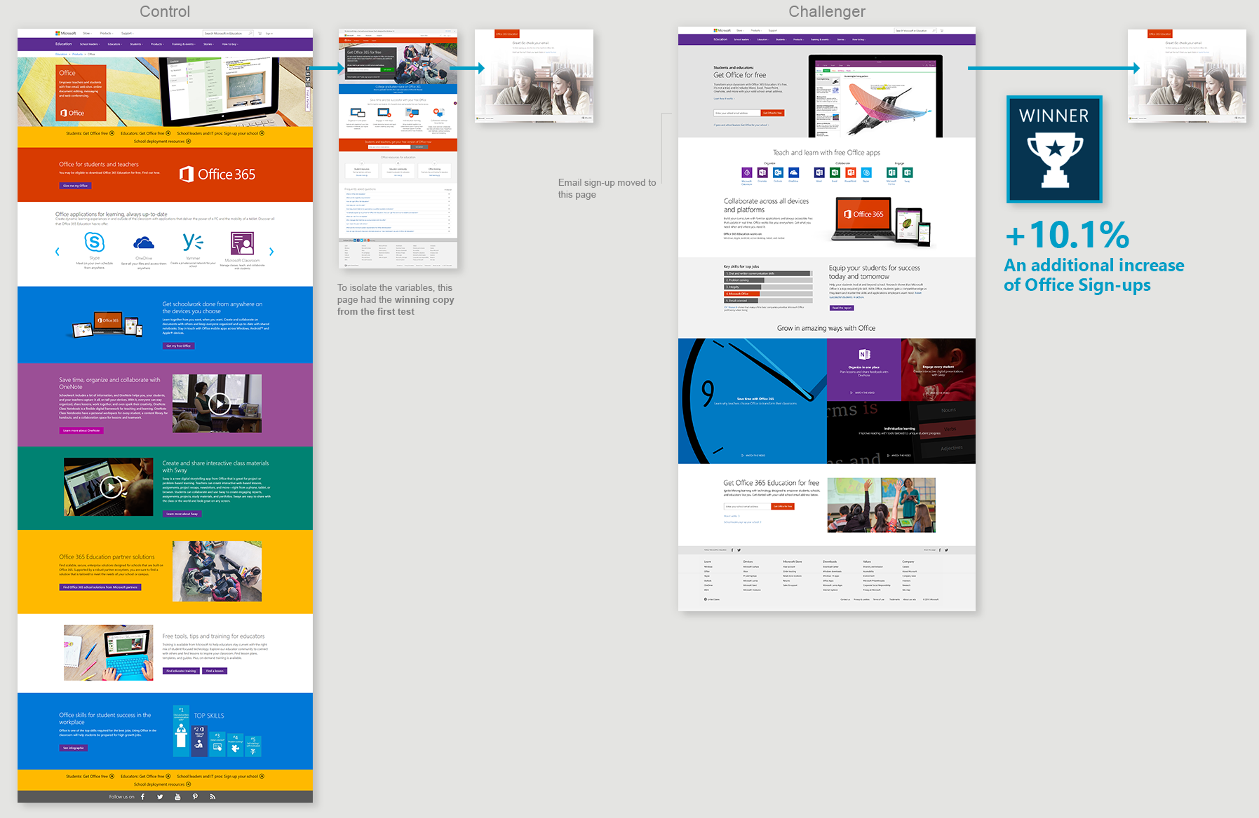
After updating the copy, I wanted to eliminate the extra page in the flow, bring the email sign-up directly to the landing page, and remove all link redundancy. I had to get buy in from the Office.com team to allow us to divert traffic from their site. Initially, we pushed to isolate just the flow change, but the Business wanted a complete page redesign at the same time. So I designed the full page.

Heat-maps
The heat-maps below show how the new design provides far more focus on the email sign up area, and the action we want the customer to take

Page Redesign
The redesign constraints and deadlines were tight for a marketing launch. We needed the redesign to fit the current models and web framework that our team created. I edited down the current page content and worked with the stakeholder on the new requirements for the page.
Desktop

Mobile


Wire-frames & Research
I generated two rounds of wire-frames. The first round emphasized the Office apps and categories, with the goal of mirroring some aspects of how Google was marketing their apps. The second round relied more on current components since round 1 wire-frames would take longer to code. The stakeholders also wanted to add a video. Additionally, I presented ideas for future development addressing two key Teacher/classroom scenarios and ways to use video to showcase to be more scenario-focused than app-focused. Our plan was to prove the 2nd hypothesis using a rapid re-design, collect data, and then address content changes.

Future Content Test Plan
This is the rough plan for testing into the middle of the page content with the goal of selling Office to teachers over it’s competitors

Data Is A Good Thing
After comparing the attention heat-maps of the control and the challenger tests, my recommendation was to de-prioritize further investment of resources in the page content. We discovered that very few customers scroll pass the Office icons, so spending more time optimizing content that no one sees was not a good use of resources. This reinforced the importance of optimizing redesign slowly into to a page because sometimes what we think is important might not actually have measurable impact.

